
22 Kitchen Paint Colors to Transform Your Space From Boring to Beautiful
Your kitchen walls have been the same color for years and you’re tired of looking at them. Maybe it’s that builder-grade greige that came with the house, or a DIY attempt that never felt quite right. Either way, you’re standing in front of the paint aisle or scrolling color chips online and the whole thing feels overwhelming. Too many options. Too many rules. Too much at stake.
This list covers 22 kitchen paint colors researched across real homeowner forums, designer blogs, and actual before-and-after photos from people who did this themselves. Each pick was included because it works in real kitchens, not just magazine shoots. You’ll find warm whites, bold darks, soft greens, rich blues, and a few options that surprised me. Budget-friendly picks start under $50 for a gallon.
This is for people spending $100 to $300 on a kitchen refresh, whether you rent or own. It’s not for anyone doing a full gut renovation. These are paint choices, and that’s it. Real results are possible with what’s here.
If you’re working with a tight number, there are plenty of ways to stretch a tight refresh budget beyond just paint.
By the end you’ll know exactly which color fits your kitchen, your cabinets, and your lighting so you can buy with confidence and stop second-guessing yourself.
What to Know Before You Start Painting Your Kitchen
- Kitchens get grease splatter, steam, and spills, so always use a washable satin or semi-gloss finish.
- Test paint samples on the actual wall first, colors read completely differently under kitchen lighting.
- One gallon covers roughly 400 sq ft, most kitchens need only 1 to 1.5 gallons for walls.
- Primer costs $20 to $30 extra but prevents dark colors from bleeding through and saves a second coat.
- Painting over glossy walls without sanding first is one of the most common mistakes, it causes peeling within months.
- North-facing kitchens lose warmth fast, cool grays can look almost purple without natural light.
- Cabinet color and wall color should share at least one undertone or they’ll fight each other visually.
- A quality brush costs $12 to $18 and cuts cleaner edges than cheap foam rollers near trim.
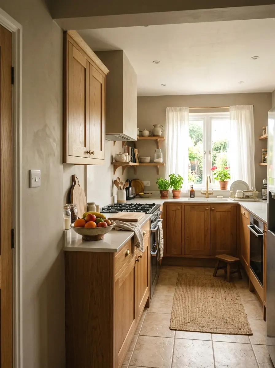
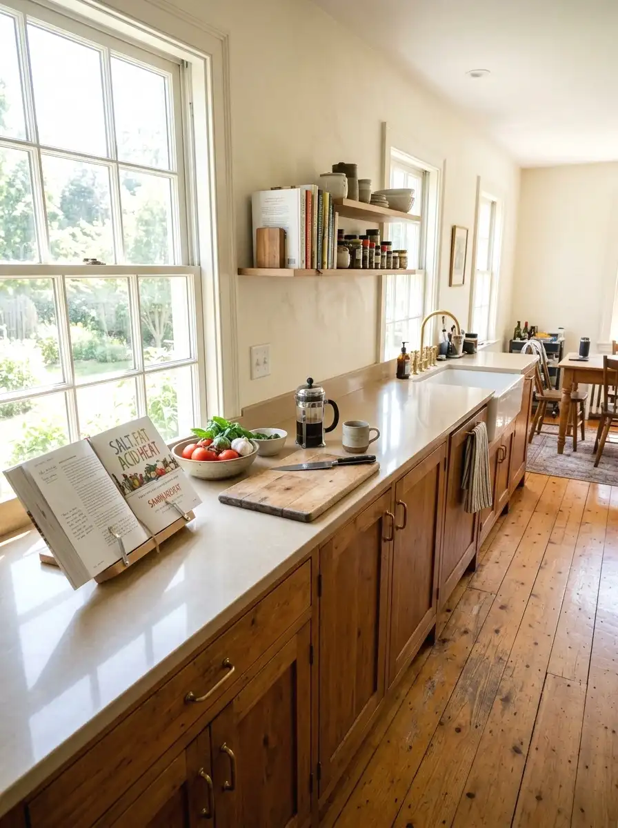
1. Soft White
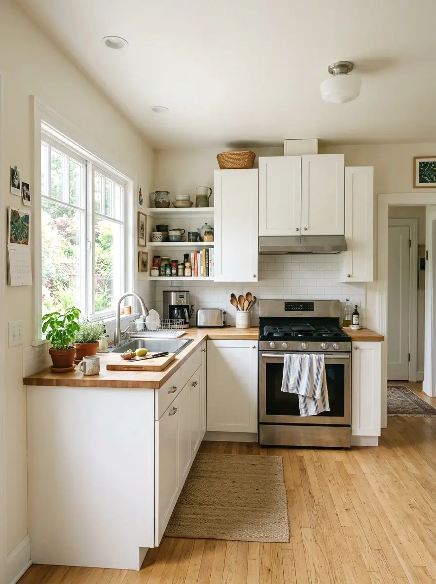
Soft white is probably the most useful paint color in any kitchen, and most people get it wrong by going too bright. Pure white reads clinical under fluorescent lights and shows every smudge on the wall within a week. The fix is simple: go slightly warm. Brands like Benjamin Moore offer “White Dove” (OC-17) and Sherwin-Williams has “Alabaster” (SW 7008), both of which sit just warm enough to feel lived-in.
When I tried Alabaster in my own kitchen, the space immediately felt bigger and cleaner without looking sterile. It runs about $70 to $80 a gallon but holds up well with a satin finish. Works especially well with wood tones, stainless steel, and almost any cabinet color you already have.
If you’re working with white cabinets specifically, it’s worth understanding how white cabinets change the whole room before locking in your wall color.
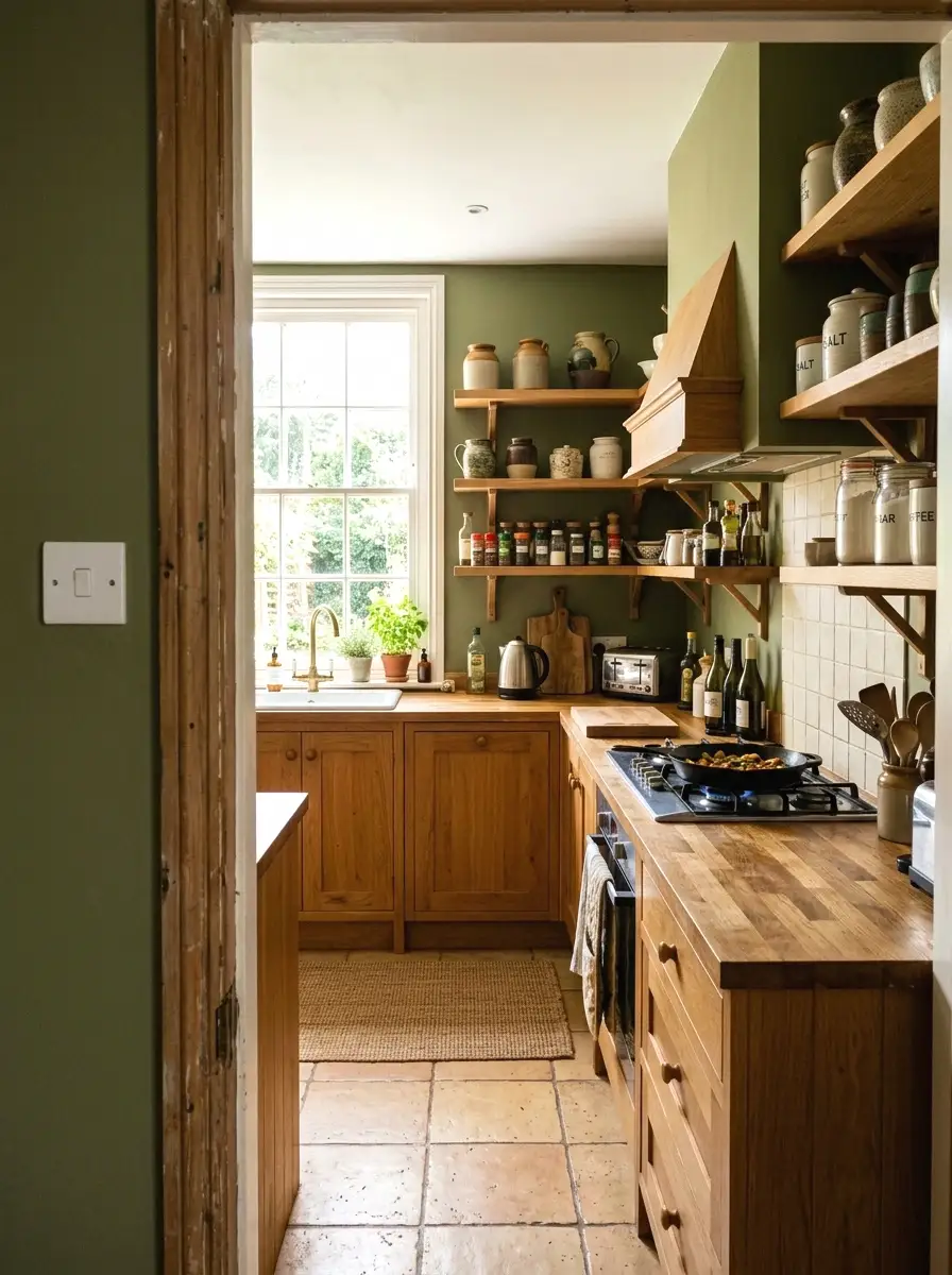
2. Sage Green
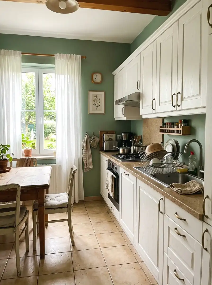
Sage green has been one of the most talked-about kitchen colors since 2023 and it still holds up in 2025 and 2026. It’s that muted, gray-leaning green that feels calm rather than loud. Think of it as what happens when you take a forest green and drain about 60% of the intensity out of it. It reads earthy and modern at the same time without trying too hard.
The key is picking a sage that leans slightly warm rather than cool. “Rosemary” by Benjamin Moore (HC-172) is a popular pick. A gallon runs about $65 to $75. It pairs really well with white cabinets, butcher block counters, and brass hardware. Renter-friendly too since it’s subtle enough that most landlords won’t notice.
More Ideas:


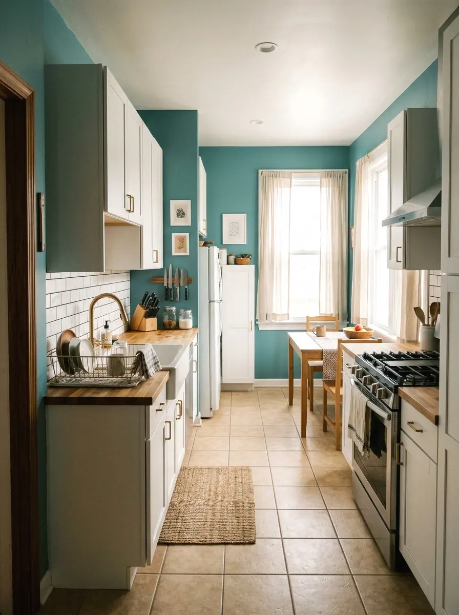
3. Navy Blue
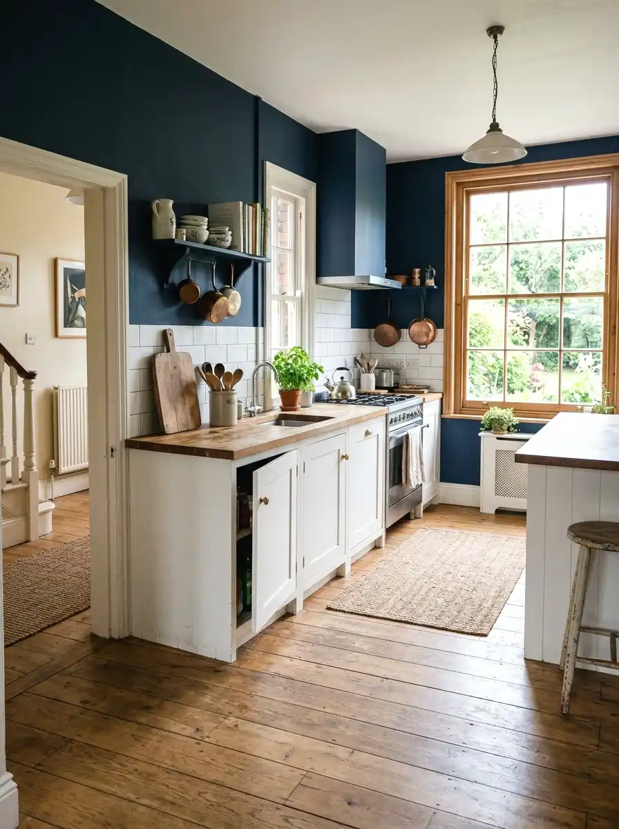
So here’s the thing about navy in a kitchen: it sounds risky but it almost always works. Dark walls actually make a small kitchen feel more intentional rather than cramped, which is the opposite of what most people expect. Navy in particular works because it reads rich without feeling heavy the way true black can.
Sherwin-Williams “Naval” (SW 6244) is the most recommended shade across design forums right now. It runs about $70 a gallon. Apply it on one accent wall or all four walls in a kitchen with decent light and you get a space that looks completely different. White trim and light counters are your best friends here.
While you’re rethinking the walls, there are some tile styles worth exploring for your walls that pair especially well with navy.
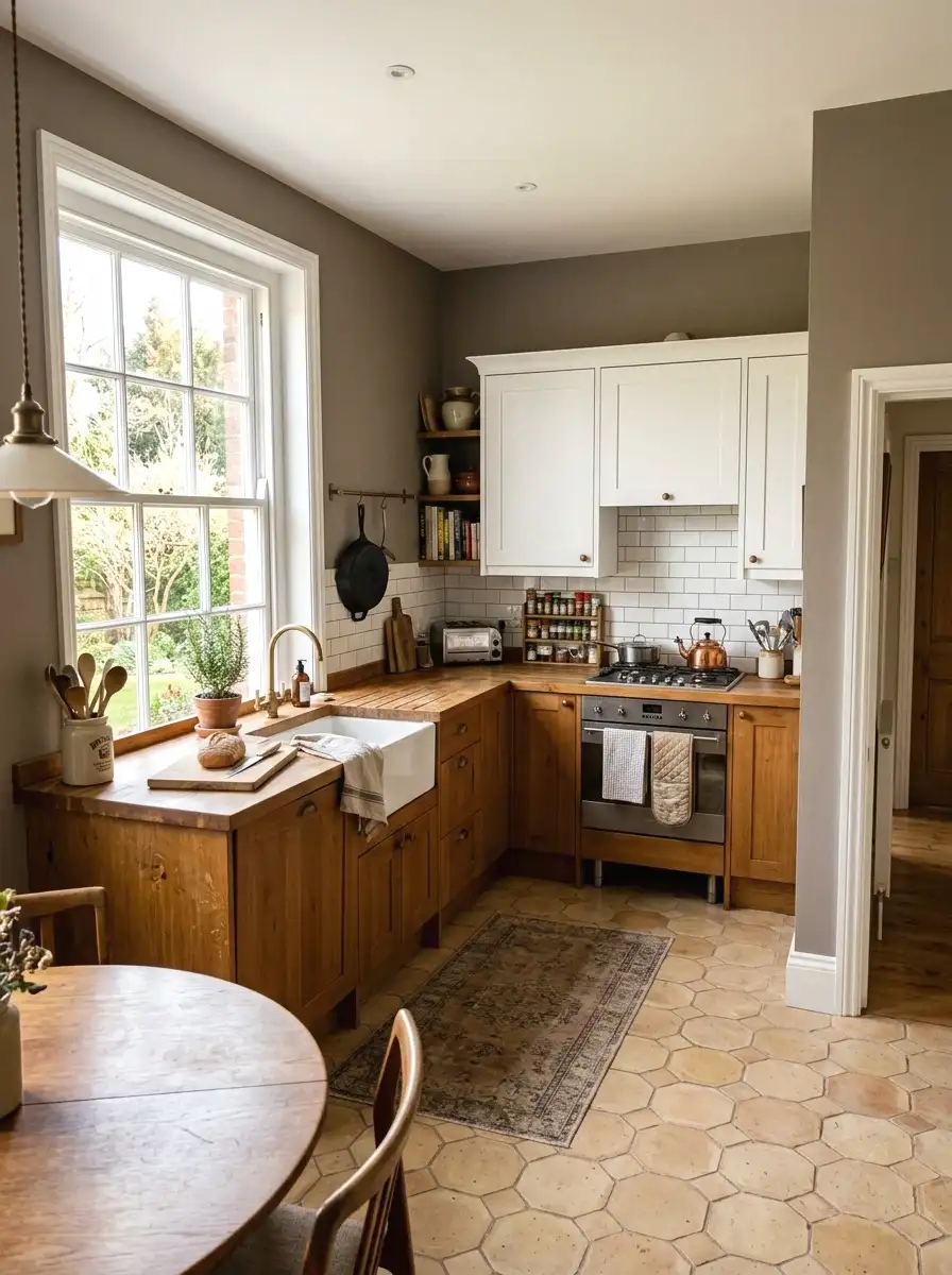
4. Warm Greige
Greige gets a bad reputation because builders have overused it for years. But the issue isn’t the color, it’s the specific shade. Builder greige tends to be cool and flat. A warm greige with a slight yellow or pink undertone is a completely different animal. It feels grounded, natural, and works with almost every wood tone and countertop material.
“Accessible Beige” by Sherwin-Williams (SW 7036) is a reliable pick at around $65 to $70 a gallon. It’s warm without reading as a full beige and it disappears into the background in the best way, letting your furniture and fixtures do the talking. Good for open floor plans where you need the kitchen to connect to a living area without clashing.
For more on this, open floor plan decorating that actually works covers how to carry color across connected spaces.
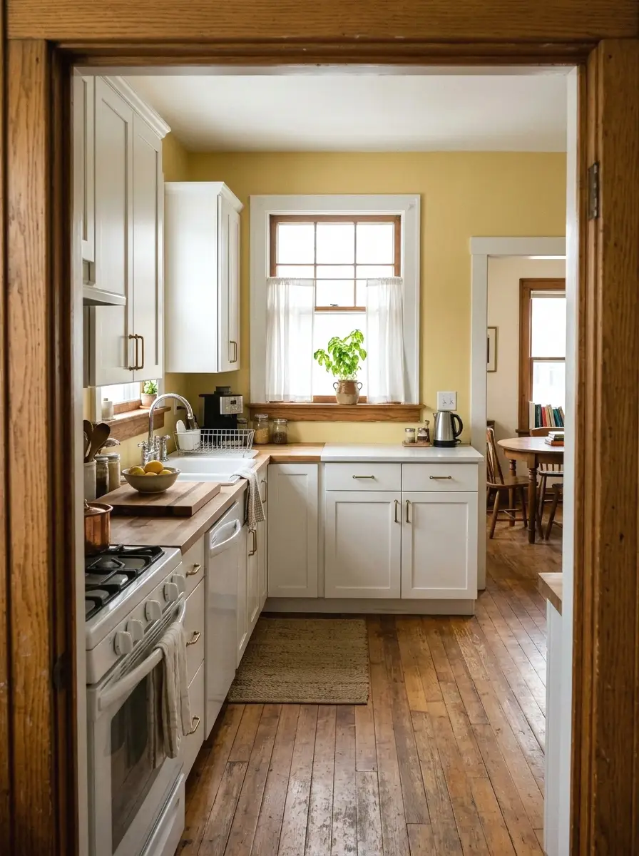
5. Pale Yellow
Pale yellow is one of those colors that sounds outdated but keeps coming back because it genuinely works in kitchens. Not the saturated crayon yellow of the 1990s. The version that’s working now is almost a white with just a whisper of yellow in it. It brings light into the space without the cold edge that true white can have.
“Lemon Sorbet” by Behr or “Pale Vista” by Benjamin Moore are both in this range. Prices sit around $55 to $65 a gallon depending on where you buy. This color is especially good for north-facing kitchens that need help feeling warm without adding warm-toned lighting. Works well with cream or off-white cabinets.
6. Terracotta
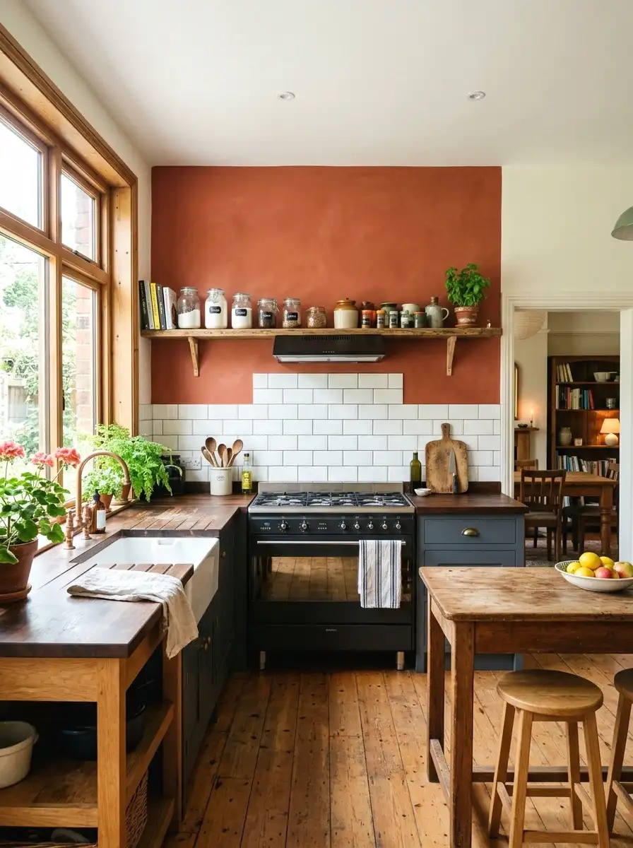
I was skeptical about this one at first but terracotta in a kitchen is one of the more surprising winners. It brings warmth and a slightly rustic, Mediterranean feel without looking like something out of a 1970s time capsule. The trick is keeping it on one wall only, usually the one behind the stove or sink, rather than going all four walls.
The shade should lean more coral than brown for a kitchen. “Dusty Miller” by Farrow and Ball is a more premium option at around $120 a gallon, but Benjamin Moore’s “Adobe Orange” (2171-30) gives you a similar result at about $70. Pairs well with white tile, open wood shelving, and matte black hardware.
More Ideas:
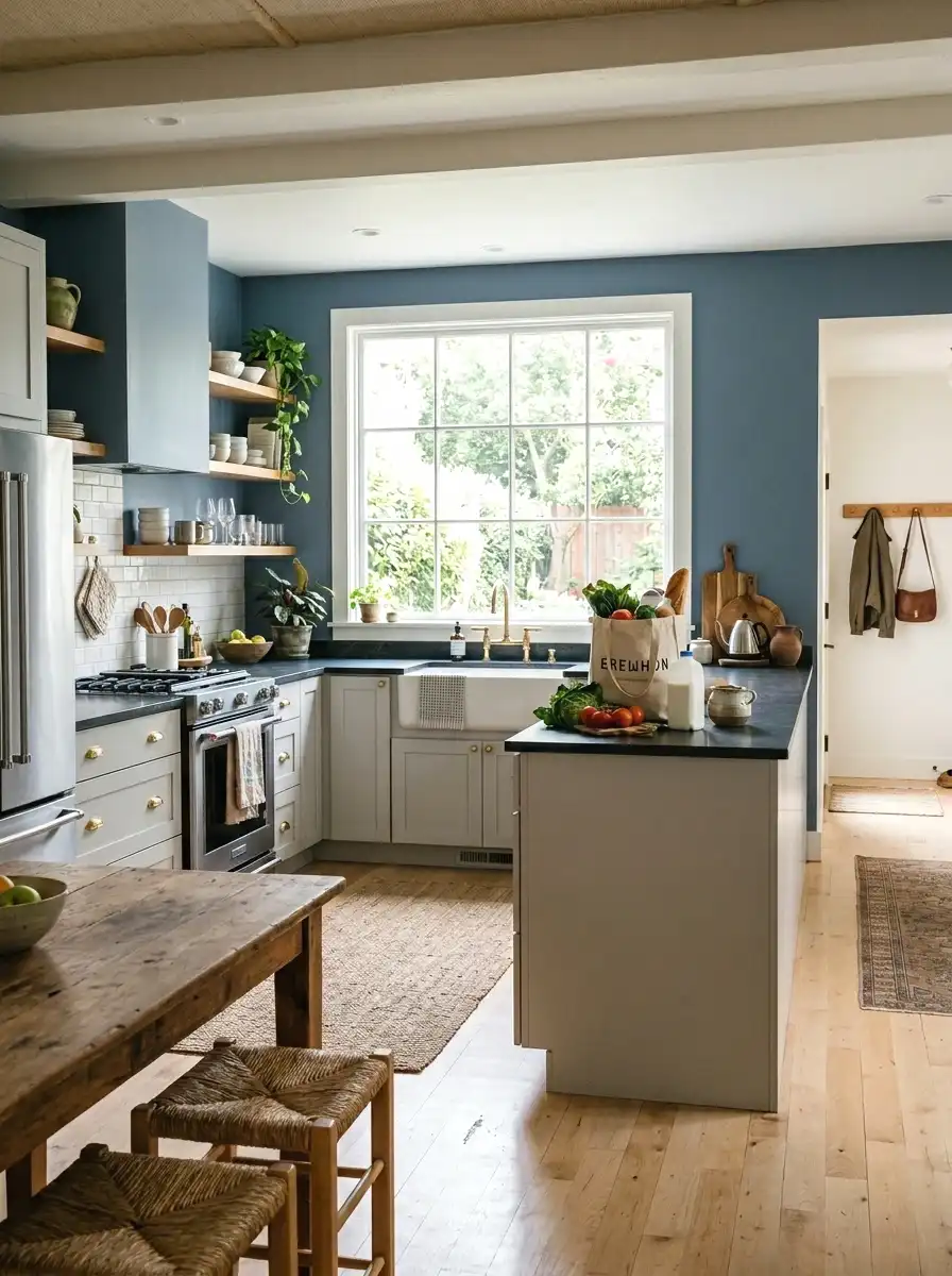
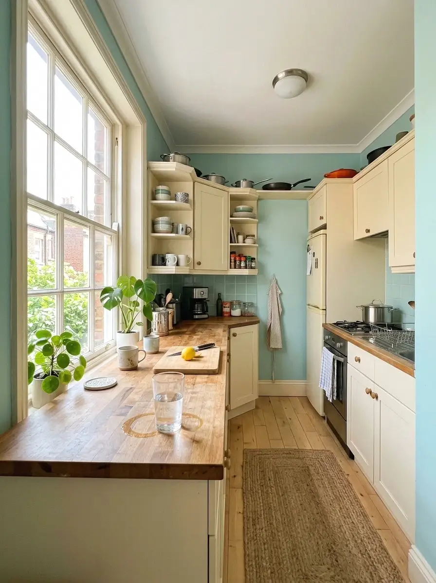
7. Dusty Blue
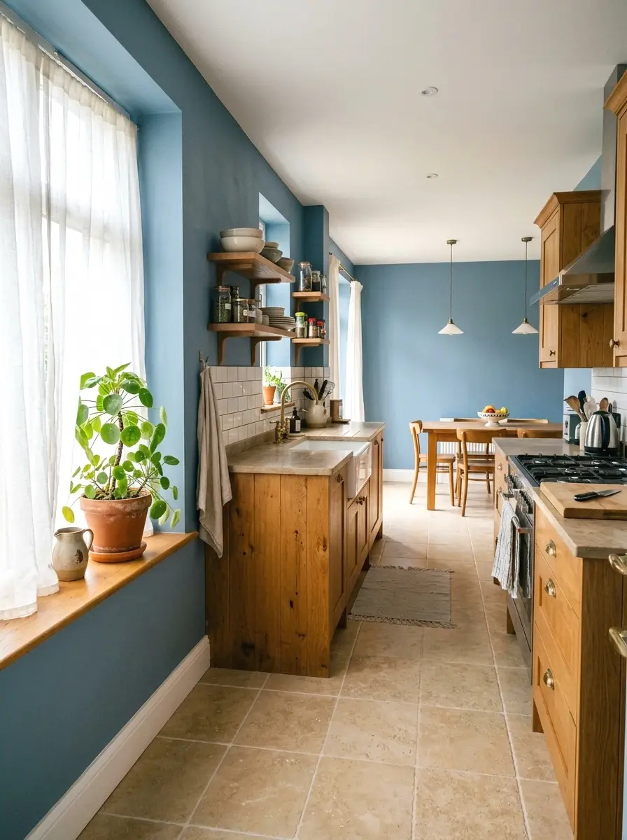
Dusty blue sits right between gray and blue in a way that reads calm without going cold. It’s a really useful kitchen color because it works as a neutral even though it has obvious color in it. You can use it with warm wood cabinets, white cabinets, or even dark gray counters and it doesn’t fight with any of them.
Sherwin-Williams “Watery” (SW 6478) or “Sea Salt” (SW 6204) are the two most referenced picks in this range. Both run $65 to $75 a gallon. (This one is so underrated, honestly.) It especially shines in coastal or cottage-style kitchens but works just as well in more modern or transitional spaces.
8. Charcoal
Charcoal on kitchen walls reads bold but not black. It gives you all the drama of a dark kitchen without the risk of going full black and regretting it. The key is picking a charcoal with some warmth in the undertone rather than a pure cool gray, which can look industrial or cold under most kitchen lighting.
“Iron Ore” by Sherwin-Williams (SW 7069) is one of the most requested dark kitchen colors right now. It runs about $70 a gallon. Pair it with light countertops and upper cabinets to balance the depth. Works especially well if you have good natural light and want the kitchen to feel like a distinct, intentional space rather than an afterthought.
9. Creamy Off-White
Off-white is different from soft white in that it sits closer to cream. It’s warmer, softer, and reads almost like a neutral but without the coldness of a true white. Kitchens that already have warm wood tones or brass hardware respond really well to this color because it brings everything together without adding contrast that fights the existing elements.
“Swiss Coffee” by Benjamin Moore (OC-45) is probably the most recommended off-white for kitchens. Around $70 a gallon. Apply it in a satin finish and it’s easy to wipe down, which matters a lot in a kitchen. Good for smaller kitchens where you want to open up the space without going white-white.
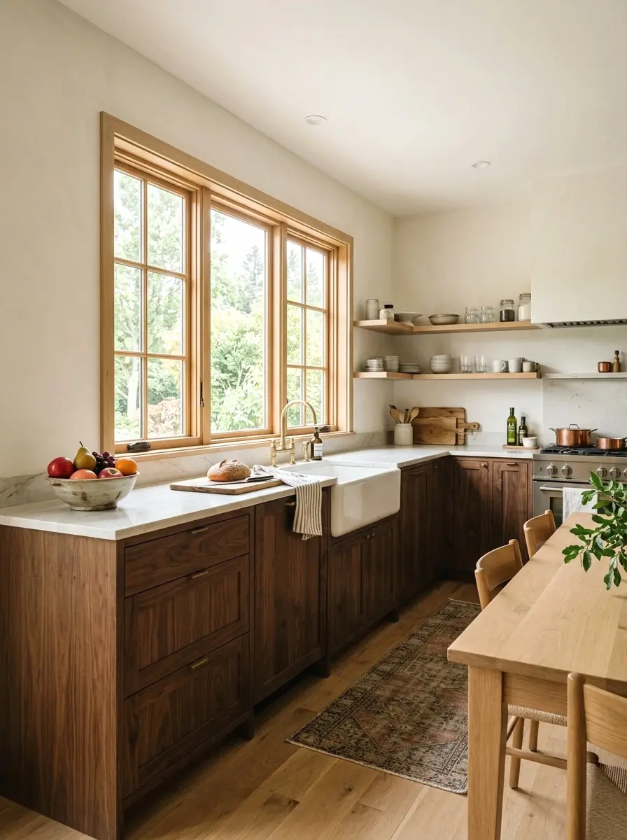
10. Forest Green
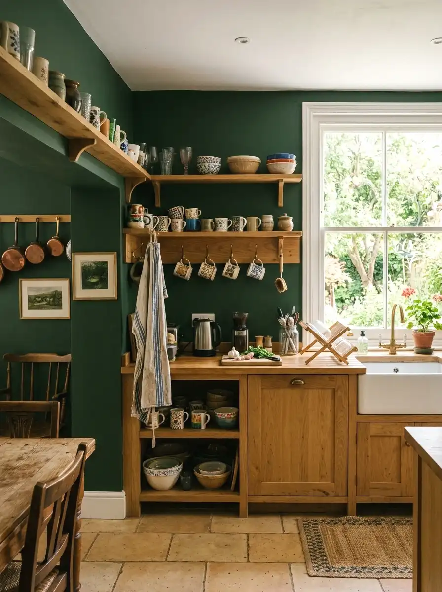
Forest green is deeper than sage and more saturated than dusty green. It’s a bold choice that works particularly well in kitchens that have a lot of natural wood or stone already in place. Think of it as a color that looks like it belongs in nature, which is why it pairs so well with organic materials.
“Rookwood Dark Green” by Sherwin-Williams (SW 2809) or “Calke Green” by Farrow and Ball are two well-loved options. The Sherwin-Williams pick comes in around $70 a gallon. Apply it in a satin finish so the depth of the color stays rich without looking flat. Best in kitchens with good light, since it can drink light in a north-facing space.
More Ideas:
11. Warm Gray
Warm gray is the middle ground for people who want gray without the cold, hospital-like feeling that cool grays can give off. A warm gray has just enough yellow or brown in its undertone to stay grounded. In a kitchen it reads modern and neutral at the same time.
“Repose Gray” by Sherwin-Williams (SW 7015) is one of the top-rated paint colors in America for a reason. It works. It runs about $65 to $70 a gallon. The thing about Repose Gray is it shifts depending on the light, reading almost lavender in cool light and warm beige in afternoon sun. Test it before committing, but in most kitchens it lands perfectly.
12. Butter Yellow
Butter yellow is warmer and more saturated than pale yellow. It’s the color of a kitchen that feels like food is always being made in it. Warm, sunny, and energetic without being overwhelming. It works best in kitchens that have good natural light because in a darker space it can start to feel muddy.
“Sunflower” by Behr or “Buttercup” by Benjamin Moore (2022-40) are solid picks. Prices are in the $55 to $65 range per gallon. This is a good color for people who want personality but aren’t ready to go bold with a dark color. Works well with white cabinets and simple hardware.
13. Mushroom
Mushroom is what you get when you take beige and make it more sophisticated. It’s a gray-brown that reads earthy and organic. In a kitchen it acts like a warm neutral that brings depth without going dark. If your kitchen has white cabinets and light counters, mushroom on the walls adds the warmth that keeps the space from reading too cold.
“Copley Gray” by Benjamin Moore (HC-104) or “Accessible Beige” leaning darker are both worth looking at. Sherwin-Williams “Accessible Beige” (SW 7036) sits right in this range at about $65 a gallon. Really good for open floor plans where you want something that bridges the kitchen to a warmer living area.
14. Slate Blue
Slate blue is darker and more serious than dusty blue. It has a gray quality to it that keeps it from feeling too vibrant, which makes it an easy color to work with in a kitchen. It reads almost as a sophisticated neutral even though it’s clearly blue. (Took me ages to figure out why this one works so well.)
“Indigo Batik” by Sherwin-Williams (SW 7602) or Benjamin Moore “Van Deusen Blue” (HC-156) are both in this category. Both run around $65 to $75 a gallon. Slate blue is particularly good with white or light gray counters and wood or brass accents. It anchors the space without making it feel dark.
If your counters are light stone, there are some white quartz countertop pairings to consider that work especially well alongside slate blue walls.
More Ideas:
15. Warm Blush
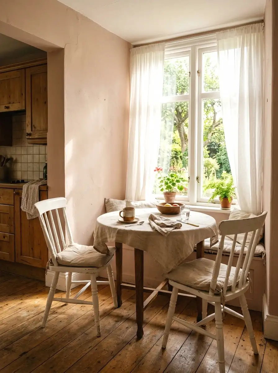
Warm blush in a kitchen sounds like a bold move but the version that works is so subtle it almost reads as white in certain lights. It’s more of a skin tone with pink in it than an obvious pink. The result is a kitchen that feels warm, personal, and slightly unexpected without being a statement color.
“Pale Blush” by Behr or “Blushing Bride” by Sherwin-Williams (SW 6567) both work. Around $55 to $65 a gallon. This color is best on just one wall or on the walls of a smaller breakfast nook off the main kitchen. In full kitchens it can feel too sweet at full saturation.
16. Olive Green
Olive green is different from sage in that it has more brown and yellow in it. It reads earthier and warmer, almost like a military green but quieter. In a kitchen it works really well with natural wood tones, terracotta accessories, and matte finishes throughout. It doesn’t fight with much.
“Dried Thyme” by Sherwin-Williams (SW 6186) is a great starting point. It runs about $70 a gallon. The warm undertone of olive green means it holds up well in north-facing kitchens where cooler greens would go flat. This one shows up a lot in what people are calling Japandi-style kitchens, that mix of Japanese minimal and Scandinavian warm that’s been big since 2024.
17. Pale Aqua
Pale aqua is a soft blue-green that brings freshness into a kitchen without going into full seafoam territory. It reads light and airy and works really well in smaller kitchens because it reflects light in a way that makes the space feel bigger. It’s a color that feels retro and modern at the same time.
“Swimming” by Farrow and Ball is a premium option but it’s worth the price around $120 a gallon if you’re doing a smaller kitchen. For a more budget-friendly pick, try Behr “Morning Sky” (M490-2) at around $55. Works best with white or cream cabinetry and simple chrome or brushed nickel hardware.
18. Rich Burgundy
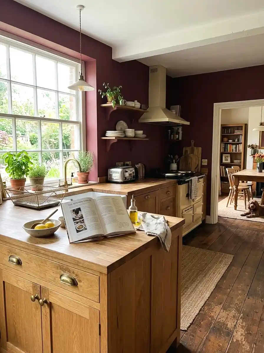
Rich burgundy is for people who want the kitchen to be a real room with personality. It’s deep, warm, and pulls from a long tradition of rooms that take color seriously. Used on all four walls it can feel moody and dinner-party ready. Used on just one wall it reads as an accent without overwhelming the space.
“Grenache” by Benjamin Moore (2083-20) or Sherwin-Williams “Antique Red” (SW 2802) are both solid options. Prices run $65 to $75 a gallon. Burgundy works best with natural wood tones, brass or gold hardware, and off-white trim. It’s a big commitment but the payoff when it lands is a kitchen that feels nothing like a rental.
Getting the full picture of color combinations that hold a kitchen together can save you from a mismatch you won’t see until everything is already painted.
More Ideas:
19. Stone White
Stone white sits between pure white and a light gray. It has enough color in it to feel intentional but enough neutrality to disappear into the background. In a kitchen it acts as an anchor that lets everything else in the room do the talking. Think of it as white that grew up a little.
“Pale Oak” by Benjamin Moore (OC-20) is probably the most loved version of this color. Around $70 to $75 a gallon. It reads warm in certain lights and cool in others, which makes it work across a lot of different cabinet colors and countertop materials. Really low-risk pick that still feels considered.
If you’re drawn to colors that behave differently throughout the day, there’s a deeper look at paint colors that shift with the light worth reading before you decide.
20. Teal
Teal in a kitchen is bold but not reckless. It’s a color with enough blue to feel fresh and enough green to feel grounded. In a kitchen with white cabinets and light floors it creates a really striking contrast without going as extreme as navy or black. And honestly, it photographs really well.
“Jetty” by Sherwin-Williams (SW 7670) or Benjamin Moore “Teal Ocean” (2058-20) are two places to start. Around $65 to $75 a gallon. Teal works especially well in kitchens that have a lot of white tile or subway tile because the color brings warmth that keeps the white from reading cold. Best used on all walls rather than one accent wall for maximum impact.
21. Linen
Linen is the color of a well-worn cotton shirt: warm, soft, and comfortable. In a kitchen it acts as a true neutral with just enough warmth to keep the space from feeling blank. It doesn’t compete with much and it ages really well over time as natural light shifts throughout the day.
“Linen White” by Benjamin Moore (OC-146) is a classic for a reason. About $70 a gallon. It’s slightly warmer than Swiss Coffee and slightly cooler than a full cream. If your kitchen has dark cabinets or strong countertop colors, linen on the walls gives everything room to breathe without draining the energy out of the space.
22. Midnight Blue-Black
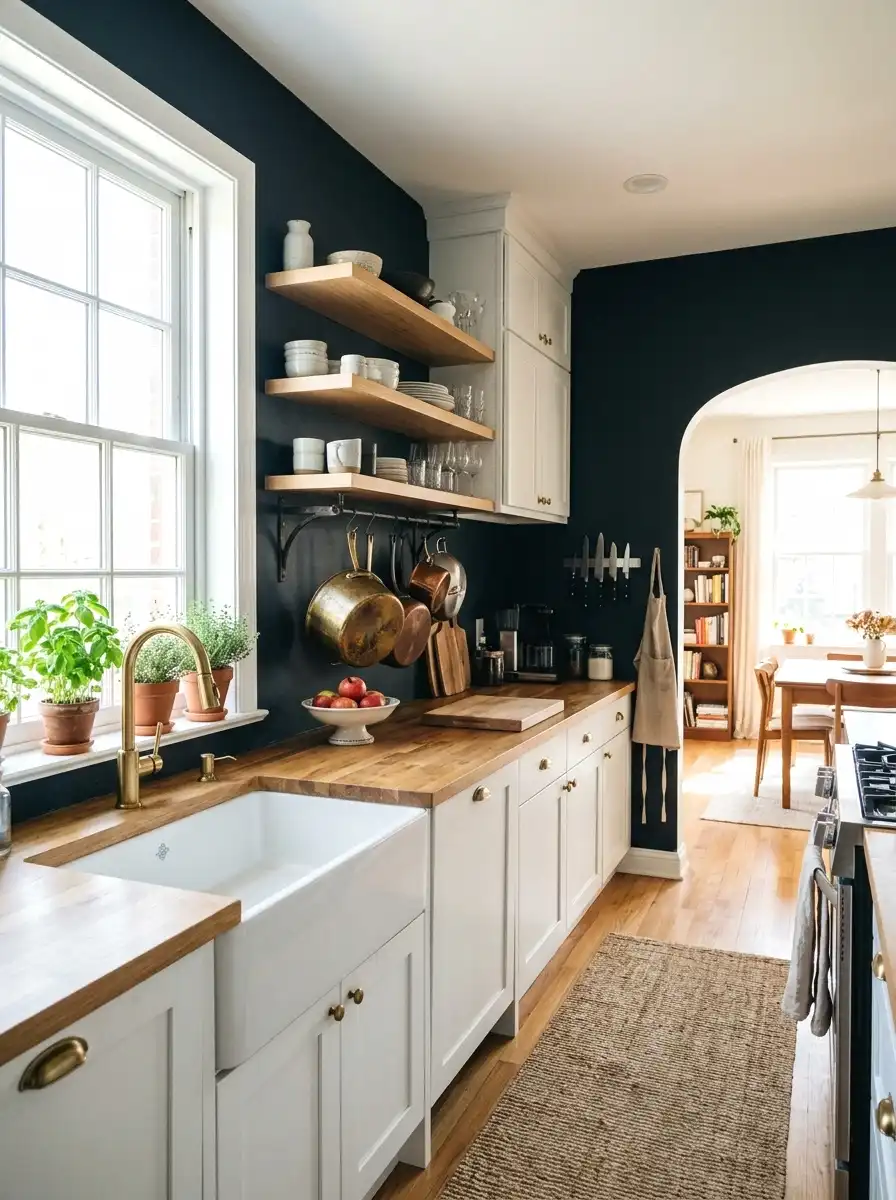
The last pick is the most dramatic one on this list and also one of the most rewarding when it works. Midnight blue-black is not quite navy and not quite black. It has enough blue in it to feel rich rather than void. In kitchens that have good artificial lighting and decent natural light it creates a space that feels polished and seriously considered.
“Hale Navy” by Benjamin Moore (HC-154) in deeper light conditions or Sherwin-Williams “Inkwell” (SW 6992) are both worth considering. Both run around $70 to $80 a gallon. This works best in kitchens where the cabinetry is light or white and the hardware is warm metal. It’s a big move but it’s the kind of color that makes guests stop and actually ask about your kitchen.
More Ideas:
Final Thoughts on Kitchen Paint Colors
You’ve got 22 colors here across every mood, budget, and cabinet situation. Most of them cost under $80 a gallon and some come in at $55. The real themes running through this list are choosing the right undertone, matching the color’s warmth or coolness to your existing finishes, and testing before you commit. Those three things account for most of the paint mistakes people make.
Start with a sample pot. Pick your top two or three from this list and buy the small tester sizes first, around $5 to $8 each. Put them on the wall as a 12-inch square. Live with them for 48 hours before making a final call.
If white cabinets are part of your kitchen, a focused guide on kitchen wall colors beside white cabinetry can help you narrow the shortlist faster.
If you want more ideas like this for the rest of your home, homelypop.com has a lot more where this came from. Real rooms, real budgets, and color advice that actually works.
For kitchens that lean into a single-color story, there are more real-room ideas across your home worth browsing if the monochrome direction is calling you.