

22 Wall Paint Colors That Transform Any Room From Flat to Fabulous

Your walls are the biggest surface in the room and somehow they’re still the thing you’ve been ignoring. Maybe you picked a color years ago that felt safe. Maybe the landlord left you with that same dingy off-white that every rental has. Either way, the room feels flat, a little tired, and nothing you buy seems to fix it. That’s not a furniture problem. It’s a wall problem.
If paint feels like too big a jump, there are plenty of other ways to refresh a tired space before you commit to a color.
These 22 wall paint colors were picked after going through real homeowner feedback, design forums, and what’s actually trending in 2025 and 2026. Each color on this list earned its spot by working in real rooms, not just staged photos. There’s a mix here from bold saturated tones to soft barely-there shades, and the budget stays real throughout, most quarts run $15 to $45.
This list is for people with a $50 to $300 paint budget who want results without hiring anyone. If you’re looking for professional color consultation or full-room repaints by a contractor, this isn’t that. But if you’re willing to roll up your sleeves and try a color, results are absolutely within reach.
By the end, you’ll have 22 specific colors to consider, with enough detail to actually pick one and start this weekend.
What to Know Before You Start Painting Your Walls
- Test your color in a 12×12-inch patch first. Lighting changes everything, what looks beige in the store looks pink at home.
- Finish matters as much as color: flat hides flaws, eggshell cleans easily, semi-gloss is for trim and kitchens.
- One gallon covers roughly 400 square feet. Measure your walls before buying so you don’t overbuy or run short.
- Most people skip primer and regret it. On dark or uneven walls, primer saves you a full coat of paint.
- Budget reality: a quality quart for one accent wall runs $18 to $45. A full-room gallon from a premium brand is $60 to $90.
- The biggest mistake is painting all four walls the same dark color in a small room. One accent wall gets the drama without boxing you in.
- For long-term durability, use a washable eggshell or satin finish in high-traffic rooms. It holds up for years without scuff
1. Warm White (Benjamin Moore White Dove OC-17)

White is not boring when it’s the right white. White Dove has a barely-there warmth to it that makes a room feel bright without going cold. It’s one of those colors that reads as just “white” to guests but makes everything else in the room look better, furniture, art, even plants seem to pop a little more against it.
I’ve seen this color in living rooms, bedrooms, and home offices and it works every time. A gallon runs about $70, which is on the higher end, but the coverage is excellent and you rarely need more than two coats. If you’re nervous about picking a color, this is a safe starting point that won’t feel like a cop-out.
2. Sage Green (Sherwin-Williams Privilege Green SW 6193)

Sage green is everywhere right now and for good reason. It’s the kind of green that doesn’t shout. It sits quietly in a room and makes everything feel a little calmer, a little more settled. Privilege Green leans slightly gray so it reads sophisticated without being cold.
This color works especially well in bedrooms and living rooms with natural light. Pair it with warm wood tones and cream textiles and you’ve got something that feels like it was designed, not just painted. A quart for testing runs about $20 at most Sherwin-Williams locations. It’s one of the most searched green shades right now for a reason.
If you’re trying to find a bedroom color that actually works with your existing furniture, it helps to look at how real people have combined shades.

3. Dusty Blue (Behr Worn Denim N530-4)
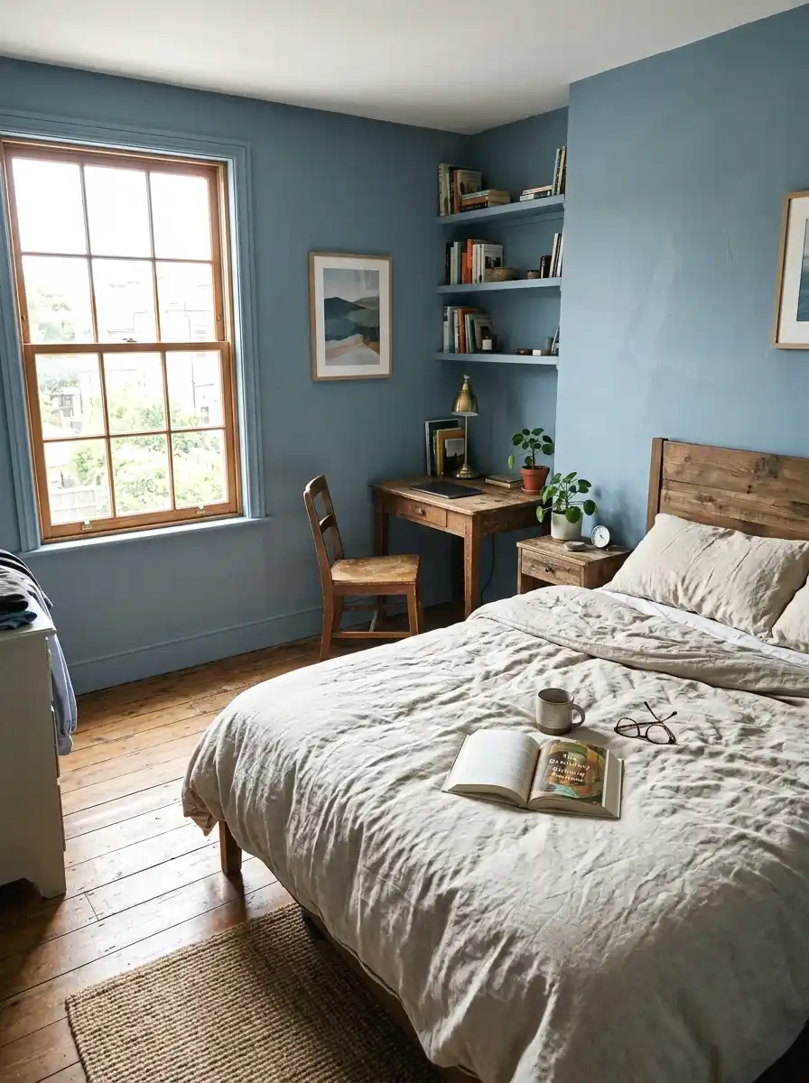
Here’s a color that photographs beautifully and lives even better. Worn Denim is a muted, faded blue that feels like the wall has always been that color. It doesn’t feel trendy. It feels like it belongs. That’s the trick with dusty blue, it settles into a room instead of announcing itself.
Bedrooms love this color. It reads relaxing without feeling cold. I was skeptical about this one but after seeing it in a friend’s spare room I immediately looked it up. Behr is sold at Home Depot and a gallon runs around $45 to $55 depending on finish. Good value for how much character it adds.
For anyone drawn to a calm and grounded bedroom aesthetic, dusty blue pairs especially well with natural materials and low-profile furniture.
4. Terracotta (Clare Potters Clay)

Terracotta is back and it doesn’t look like the 90s anymore. Clare’s Potters Clay is a warm, earthy orange-red that works beautifully in dining rooms and entryways. It creates an instant sense of warmth, the kind that makes you feel like you walked into somewhere intentional.
The key with terracotta is keeping the rest of the room calm. Neutral linen curtains, light wood, a simple rug. Let the wall do the talking. Clare sells sample pots for about $7, which is a great way to test before committing. A full gallon is around $55. One accent wall is usually all you need.
5. Deep Navy (Farrow and Ball Hague Blue No. 30)

Deep navy is one of those colors that scares people and then completely wins them over. Hague Blue is rich and dark with a slight green undertone that keeps it from feeling flat. On a single wall, it creates serious depth. In a full room, it feels like something out of a boutique hotel.
It works best in rooms with decent light and warm accessories. Brass hardware, cream upholstery, a jute rug. Farrow and Ball is expensive, around $115 per gallon, but the pigment is so dense you often get great coverage in fewer coats. Worth it if your budget allows.
6. Greige (Sherwin-Williams Agreeable Gray SW 7029)

Greige is gray with just enough beige in it to feel warm. Agreeable Gray is the most popular paint color in America for multiple years running and the reason is simple: it works in almost any light, with almost any furniture, in almost any room. That’s rare.
It’s not the most exciting pick on this list. But sometimes you need a color that just works without fuss. It photographs well, sells houses, and feels polished without trying too hard. A gallon from Sherwin-Williams runs about $75. If you’re repainting before listing your home or want a reliable neutral, this is it.
7. Burnt Orange (Backdrop Burnt Sienna)

So this one gets overlooked because people confuse it with the orange of the 1970s. Burnt sienna is different. It’s deeper, more brown, more grounded. On a single accent wall it feels warm and earthy without reading as Halloween. It’s especially good in living rooms with plenty of natural wood and plants.
If you love the warmth of earthy warm living room ideas, this shade fits naturally into that world.
Backdrop is a newer paint brand with great reviews and easy online ordering. A sample is about $5 and a full quart runs around $20. The color pairs well with dark green, cream, and black accents. Try it in a room that gets afternoon sun and watch what happens.
8. Pale Pink (Portola Paints Blush)
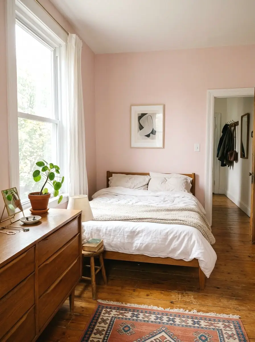
Pale pink gets dismissed as a nursery color and that’s a shame. A dusty, muted pale pink on a bedroom wall is one of the most calming things you can do. It reads almost neutral in low light but has just enough warmth to feel different from white.
When I tried this in my own space, a small bedroom that felt cold and disconnected, the whole room softened. The color made the white bedding look warmer, the wood floors look richer. Total cost for one accent wall was about $18 for a quart. Portola Paints has good quality and the shade selection is genuinely nice.
9. Forest Green (Benjamin Moore Tarrytown Green HC-134)

Deep, moody, dark green is one of the defining colors of 2025 and 2026 interiors. Tarrytown Green is a rich forest shade with just enough complexity to shift slightly depending on the light. In morning light it reads green. In the evening with warm lamps it goes almost black-green.
It works in studies, libraries, dining rooms, and bedrooms that want drama. Pair it with antique brass, dark wood, and warm lighting and it feels like something special. A gallon from Benjamin Moore runs around $80. One statement wall is usually enough.
10. Soft Lavender (Farrow and Ball Calluna No. 270)
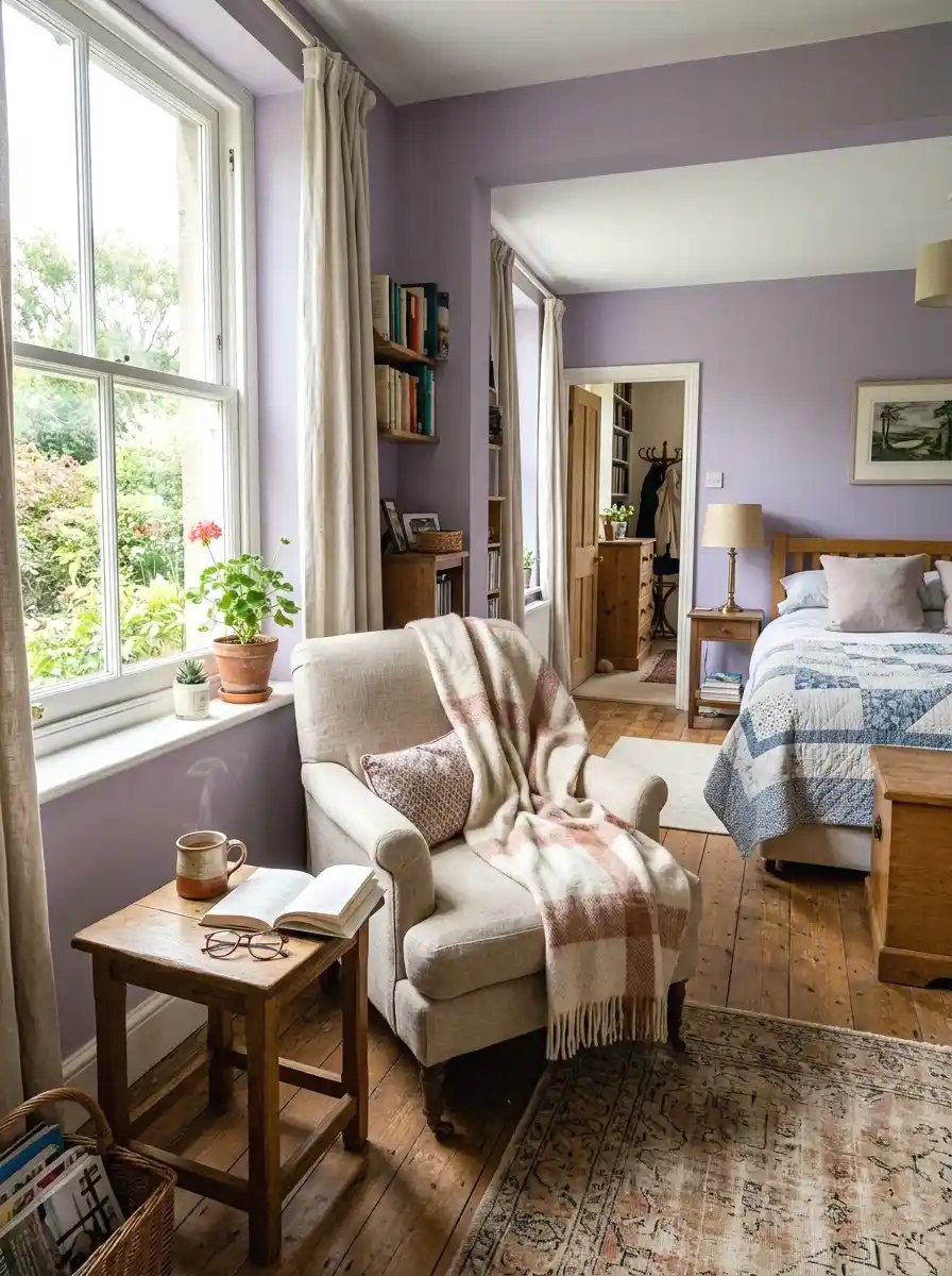
Lavender sounds risky but Calluna is the version that works. It’s not purple. It’s a soft, slightly grayed lavender that reads almost like a warm neutral in certain lights. It’s subtle enough that it doesn’t announce itself but adds just enough color to feel intentional.
Bedrooms and reading nooks are the ideal setting. It pairs well with linen, cream, and soft warm lighting. Farrow and Ball is pricier at around $115 a gallon but their sample pots at $12 are worth getting before you commit. The color shifts dramatically between natural and artificial light, so test it in both.
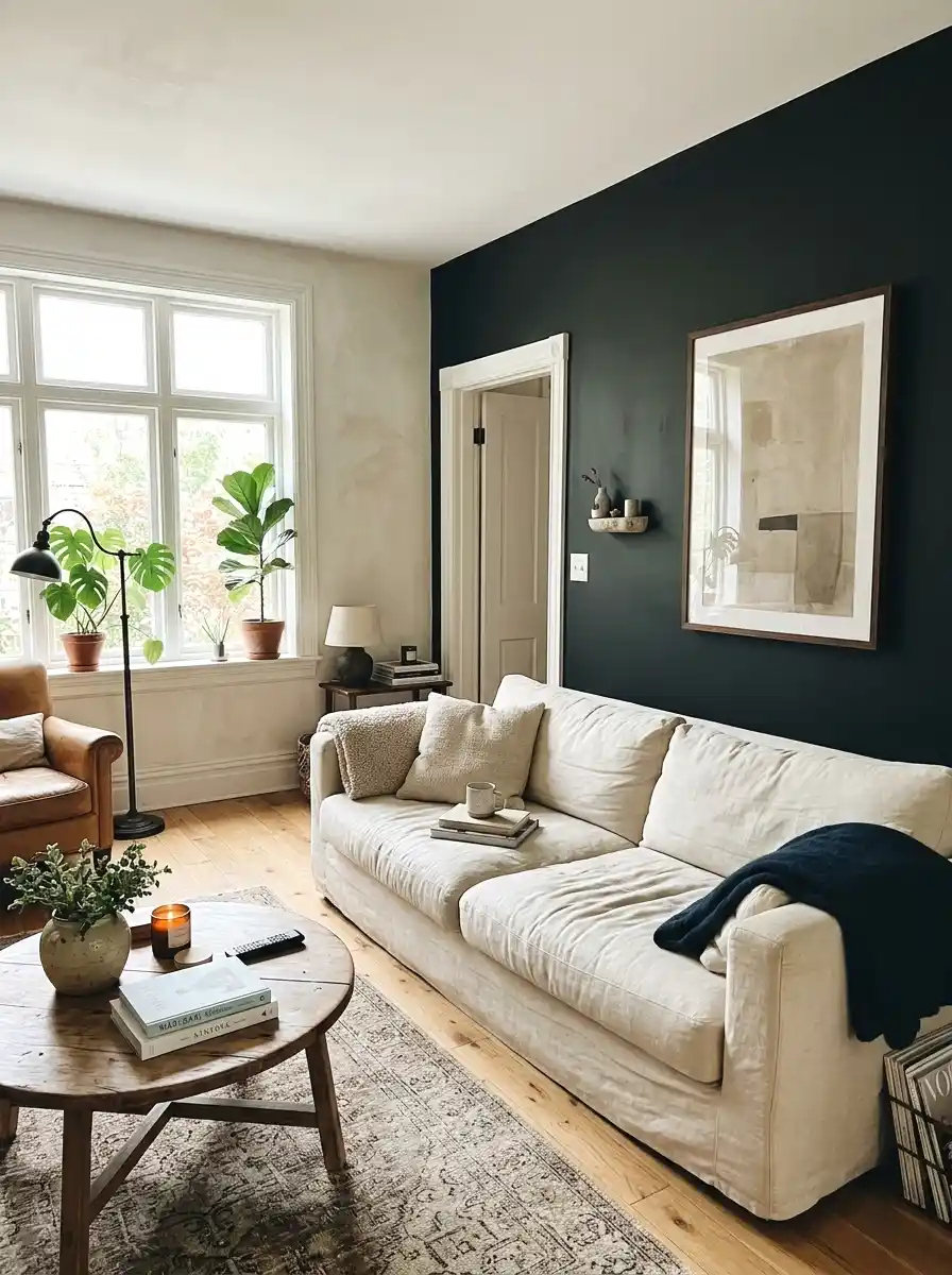
11. Charcoal (Sherwin-Williams Peppercorn SW 7674)

Peppercorn is a dark, warm charcoal that stops just short of black. It’s one of those colors that sounds intimidating and then completely wins you over in person. On a single accent wall behind a bed or sofa it creates strong visual contrast without making the room feel smaller.
The key is keeping the other three walls lighter, cream, white, or a very light gray. Then let Peppercorn anchor the room. It works in bedrooms, home offices, and living rooms. A gallon from Sherwin-Williams runs about $75. It photographs really well, which matters if you ever share your space online.
12. Warm Caramel (Clare Sundowner)

Caramel is underrated. Not orange, not yellow, not brown, it sits right in the middle and has a warmth that feels genuinely welcoming. Sundowner is the exact shade. It works beautifully in dining rooms and entryways because it makes people feel immediately at ease when they walk in.
It also photographs warmly in candlelight or dim pendant lighting, which makes dinner gatherings feel a little more special. This one is so underrated. Clare sells it in quarts for about $20 and the formula goes on smoothly. Two coats is usually enough for full coverage.
13. Steel Blue (Behr In the Moment S510-2)

In the Moment is a medium steel blue that feels grounded and calm. It’s not as saturated as a classic blue but it has more personality than a pale powder blue. It lands somewhere in between and that balance is exactly what makes it work in so many rooms.
Living rooms with neutral furniture look great with this on one wall. It also works in home offices where you want focus without sterility. Behr at Home Depot runs about $45 to $55 per gallon. The color reads slightly darker in north-facing rooms so grab a sample first if your room doesn’t get much direct light.
If you’re building a home office that feels focused without being cold, steel blue is one of the most underrated choices you can make.
14. Cream (Benjamin Moore Linen White OC-146)

Linen White is cream done right. It avoids the yellowish trap that some creams fall into and instead leans slightly pink-warm. In a bright, sunny room it feels like the walls are glowing. In a darker room it adds warmth without going dingy.
This is my go-to recommendation for anyone who thinks they want white but secretly wants a little more. It pairs beautifully with natural wood, warm metals like brass and copper, and any kind of textile in earthy tones. A gallon from Benjamin Moore runs about $70 and the coverage is excellent.
15. Dusty Rose (Sherwin-Williams Romance SW 6320)
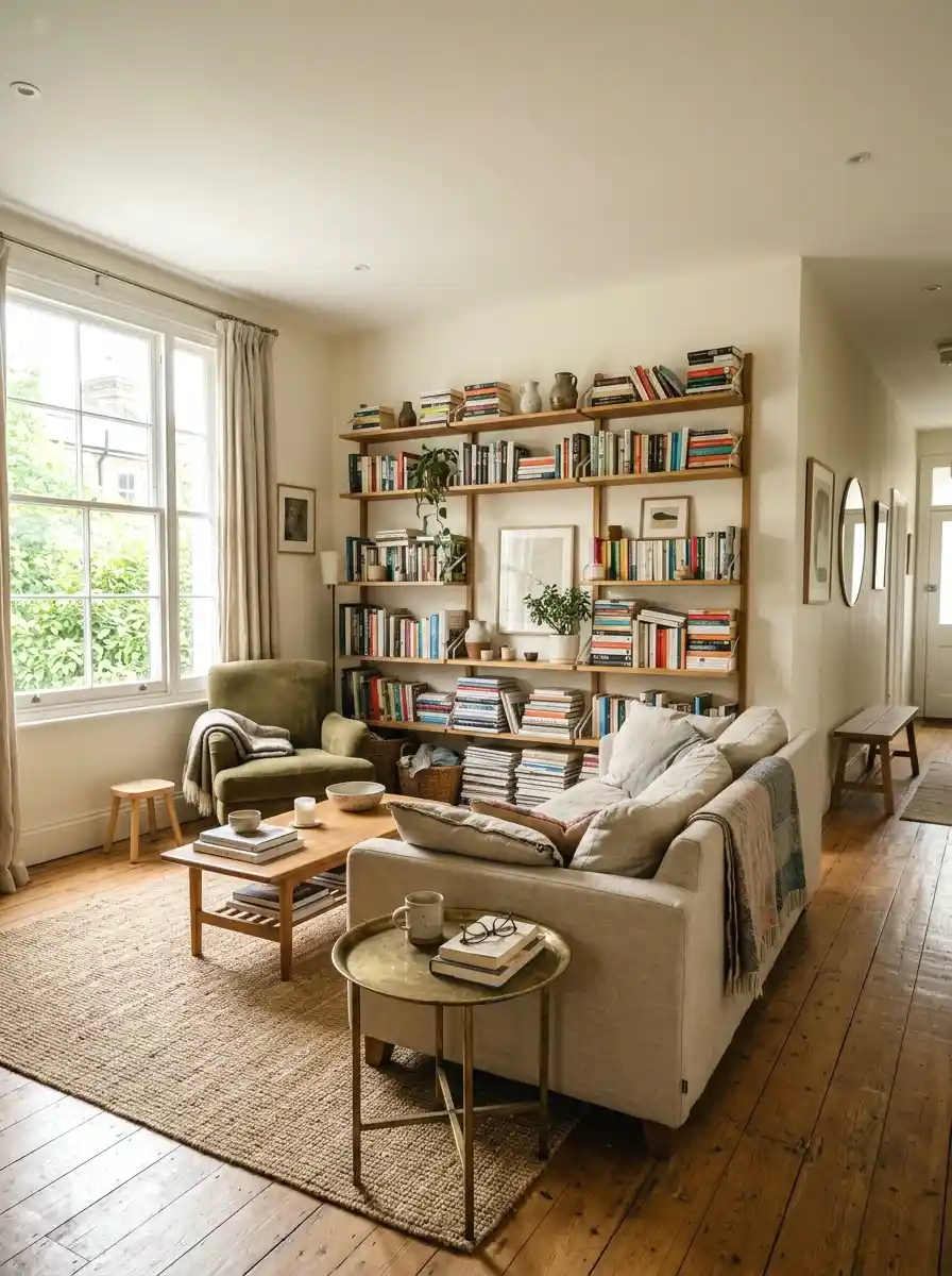
Romance is a dusty rose with enough gray in it to feel polished rather than sweet. It works in bedrooms and bathrooms and pairs well with gold hardware, marble textures, and cream or white linens. It’s the kind of color that guests always notice and ask about.
Took me ages to figure this out, but dusty rose reads completely differently depending on your lighting. In warm light it goes rich and peachy. In cool light it goes more mauve. Both are good. A quart for testing runs about $20 at Sherwin-Williams and the full gallon is around $75.
16. Cobalt Blue (Backdrop Night Swimming)

Cobalt is for the bold. Night Swimming is a rich, saturated blue with just enough depth to avoid going flat. On a single accent wall in a white room it creates a graphic, high-contrast look that feels intentional and designed. It’s a statement color.
It works in living rooms, entryways, and even kitchens if you’re brave. Keep everything else simple: white trim, light floors, minimal art. Let the wall be the main event. Backdrop sells this in quarts for around $20 and the color is extremely pigmented so one coat often gets you most of the way there.
17. Warm Gray (Farrow and Ball Purbeck Stone No. 275)

Warm gray is what people mean when they say they want gray but don’t want it to feel cold. Purbeck Stone is on the beige side of gray, which means it photographs warm, feels warm in person, and doesn’t turn purple or blue in low light the way cooler grays do.
It’s a classic background color that makes furniture and art look better without competing with them. Works in any room. Farrow and Ball is around $115 per gallon but the pigment is heavy and coverage is good. If the price is too high, Sherwin-Williams Accessible Beige is a close match at half the price.
18. Olive Green (Clare Going Places)

Olive green sits at the intersection of brown and green and the result is a color that feels grounded, earthy, and genuinely different from the typical greens you see everywhere. Going Places is Clare’s take on it and it’s a great one. It looks especially good in kitchens, entryways, and spaces with natural materials.
Pair it with terracotta accents, warm brass, and natural wood and you’ve got a room that feels put together without trying too hard. And honestly, olive is one of those colors that grows on you. A quart from Clare runs about $20, a full gallon is around $55.
19. Peacock Teal (Benjamin Moore Teal Ocean 2055-30)

Teal is one of those colors that you either love immediately or take a while to come around to. Teal Ocean lands on the green side of teal, which makes it feel more natural and a little less electric than blue-heavy teals. In a room with warm wood tones it looks really good.
It works well in bathrooms, bedrooms, or as an accent in a living room. The depth of the color means it looks different in every light, which keeps it interesting. A gallon from Benjamin Moore is about $80. Grab a sample pot first because this color is sensitive to lighting and room size.
20. Off-Black (Sherwin-Williams Tricorn Black SW 6258)

True black walls are polarizing. But Tricorn Black, which reads as a very dark charcoal with virtually no undertone, is about as close to black as you can get without it feeling like a void. On one wall in a room with good lighting, it’s dramatic in the best way.
It makes art pop off the wall. It makes light fixtures look more expensive. It makes the whole room feel intentional. The trick is good lighting, both natural and artificial. Without it, the color can feel heavy. A gallon from Sherwin-Williams runs about $75. One accent wall is usually the right call.
If you’re curious what moody dark room design done right actually looks like in a real space, there are some great examples worth browsing.
21. Blush Peach (Portola Paints Canyon Rose)
Canyon Rose is a warm blush that leans more peach than pink. In rooms with warm light it glows. In bright morning light it reads almost like a sunlit neutral. It’s subtle enough to feel grown-up but warm enough to feel welcoming.
It’s one of my favorite colors for small spaces because the warmth tricks the eye into seeing the room as bigger and softer at the same time. A quart runs about $18, which makes testing it basically risk-free. Works well in bedrooms, bathrooms, or any room that needs a little warmth without going full terracotta.
There are quite a few small room decorating tricks that help beyond just paint, and combining them makes a noticeable difference.
22. Moody Plum (Benjamin Moore Concord Grape 2068-20)

The last color on this list is the bravest one. Concord Grape is a deep, rich plum that sits between purple and eggplant. It’s not a color you use everywhere. But on one accent wall in a bedroom or dining room, it creates an atmosphere that no other color on this list can match.
For inspiration on building a dining room atmosphere with bold color, it helps to see how others have styled the full room around a single dramatic wall.
It works best with warm lighting, brass or gold accents, and furniture in cream, tan, or dark walnut. Keep the other walls white or very light so the plum wall can breathe. A gallon from Benjamin Moore runs about $80. This one is not for everyone, but if it speaks to you, go for it.
Final Thoughts on Wall Paint Colors
You now have 22 real colors with real prices and real room applications. The through-line here is that the best wall paint isn’t always the boldest or the most expensive. It’s the one that fits your light, your furniture, and the feeling you want in that room. Some of these are safe starters. Some are full commitment moves. All of them work.
Start small if you’re nervous. Pick one color from this list, buy a sample pot, and paint a 12-inch square on your wall this weekend. Live with it for two days in different lighting. That’s it. That’s the whole first step. You don’t have to commit to anything yet.
If you want more ideas like this, homelypop.com has a lot more where this came from. Real budgets, real rooms, real advice.
There are plenty of room ideas worth exploring next if you’re still narrowing down your direction.


