
20 Best Colors for Laundry Room Cabinets That Make the Space Beautiful

You’ve stared at those cabinets long enough. They’re either some leftover builder beige that makes the whole room feel like a waiting room, or they’re a dark color that swallows whatever little light you actually have in there. You know the cabinets need a change. You just can’t figure out what color won’t make things worse.
I’ve pulled together 18 cabinet color ideas for this article, covering everything from bright whites and soft pastels to deep, moody tones that look really nice in a utility space. Each one was picked because it solves a real problem — too dark, too small, too boring, too clinical. Some ideas work under $100. A few cost more if you’re refinishing rather than repainting.
This is for homeowners and renters with some flexibility on paint, working with a budget of about $100 to $300. It’s not for anyone planning a full gut renovation. You don’t need to be a painter either. These results are doable on a weekend.
By the end, you’ll know exactly which color direction fits your space and what to do first.
If you want to go beyond cabinets, there are plenty of other ways to refresh a utility space without a full renovation.
What to Know Before You Paint Laundry Room Cabinets
- High-humidity rooms need semi-gloss or satin finish paint, not flat or eggshell.
- Dark cabinets in rooms under 60 sq ft make the space feel much smaller visually.
- Budget for primer separately — skipping it causes peeling within six months.
- Cabinet paint costs $30 to $80 per quart, which covers roughly two standard upper cabinets.
- Most people forget to paint the interior edges — skipping them looks unfinished when doors are open.
- Sand lightly between coats or the finish will feel rough and look uneven.
- White cabinets show yellowing faster near steam-producing appliances like dryers.
- A color tested as a 2×2 inch swatch looks completely different at full cabinet scale.
1. Crisp White

White is the most picked cabinet color for laundry rooms, and honestly it makes sense. A laundry room is already packed with equipment, visual noise, and sometimes very little natural light. White opens things up in a way no other color does as reliably. It reflects light back into the room and makes the whole space feel cleaner before you’ve even done a load.
The thing people get wrong is picking the wrong white. Warm whites like Sherwin-Williams “Alabaster” or Benjamin Moore “White Dove” are going to look much better than a cold, bright white under yellow artificial light. That stark cool white looks great on Instagram and weird in your actual house. A quart of cabinet-specific paint runs about $40 to $60, and one quart will handle two to three uppers easily.
2. Soft Gray
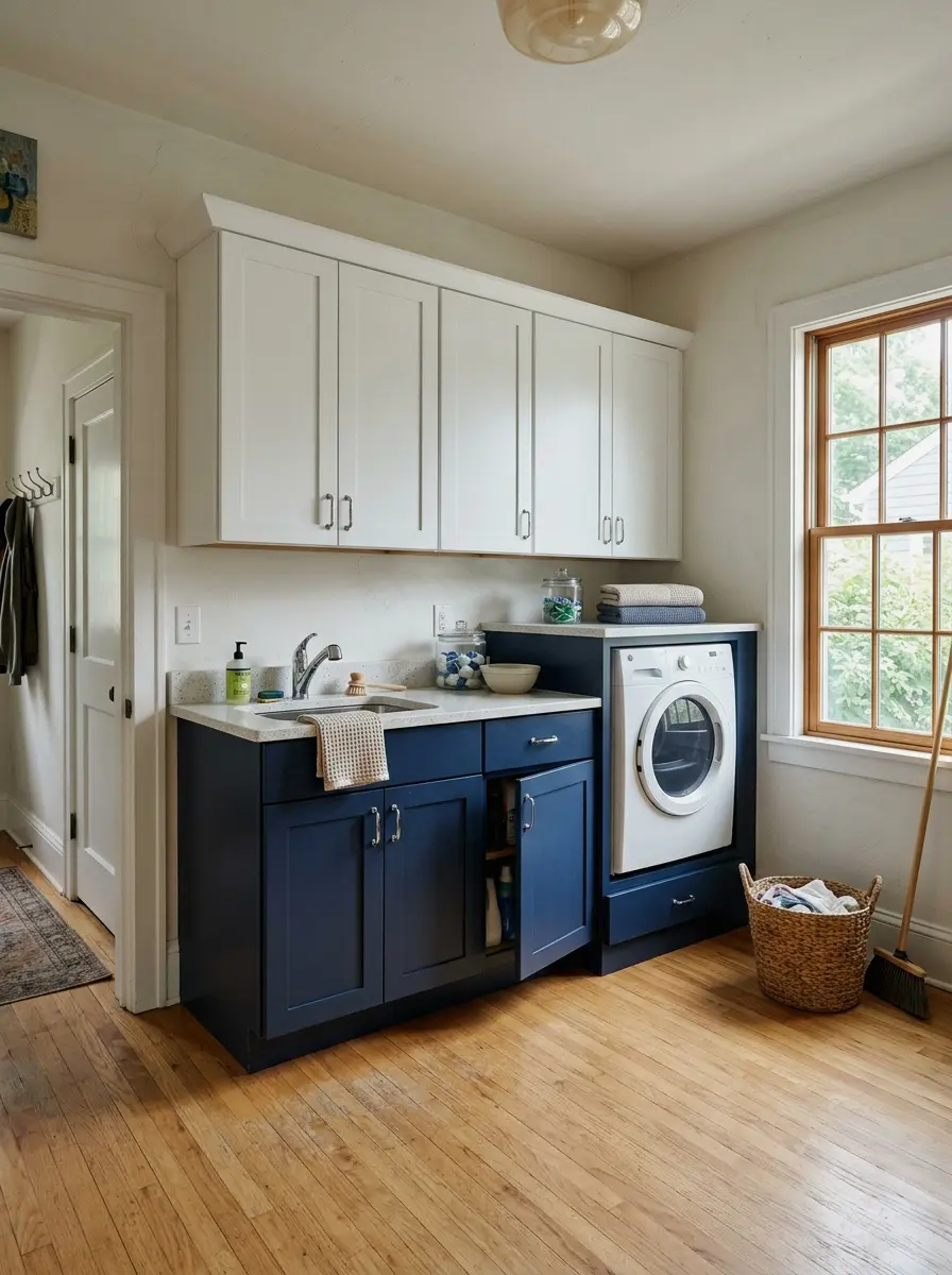
Gray sits in this sweet spot where it reads as neutral but isn’t boring. It pairs with almost every hardware finish, so if you’ve already got chrome or brushed nickel on your fixtures, gray cabinets won’t fight with any of it. It’s also much more forgiving than white when it comes to dirt and scuffs, which matters a lot in a room where you’re handling laundry constantly.
When I tried a soft gray in a utility-style room, I was surprised how much it made the white walls feel intentional rather than just unfinished. The contrast is subtle but it works. Go for something in the light to mid range, like Benjamin Moore “Gray Owl” or Behr “Silver Drop.” These sit around $45 to $55 a quart and don’t require as many coats as darker shades.
More Ideas:


7. Black or Deep Charcoal
Here’s what nobody tells you about dark cabinets in a laundry room: they can look really good if you commit fully. A deep charcoal or matte black on cabinets against white walls and bright lighting creates a look that feels intentional and finished in a way that pale colors sometimes don’t. The contrast is what makes it work.
The practical caveat is that this only works if your lighting is solid. If the room is dark to start, dark cabinets will make it feel like a closet. But if you’ve got a decent overhead fixture or a window, going dark with the cabinets is actually a low-effort way to make the room look designed. (this one is so underrated) Farrow and Ball “Railings” or Behr “Cracked Pepper” are great options in the $50 to $80 range per quart.
If you’re not sure your current setup is strong enough, it’s worth looking at lighting setups that make dark walls work before you commit to the paint.
8. Pale Yellow
Pale yellow gets overlooked because people assume it’s risky. It’s actually one of the warmest, most welcoming options for a laundry room, especially in a space with no natural light. A soft butter yellow bounces light around in a way that feels sunny even when it isn’t. It makes the room feel like you actually want to be in there, which is a bigger deal than it sounds.
You have to stay out of the egg-yolk range here. The sweet spot is very light, almost cream with a hint of yellow. Benjamin Moore “Lemon Sorbet” or Sherwin-Williams “Butter Up” are both solid options. When I tried a similar color in a narrow utility room, the whole mood shifted in a way I wasn’t expecting. The space felt bigger and warmer, and the white appliances looked better against it too.
9. Off-White or Cream

Off-white is a softer, more livable version of white that doesn’t have any of the harsh-light problems. It’s warmer, it ages better, and it doesn’t show every smudge quite as aggressively as a bright white does. In a working laundry room where hands are always grabby and damp, that matters a lot.
The difference between off-white and greige is subtle but real. Off-white leans more toward white with a warm softness, while greige leans more toward gray and beige. If your other cabinets or trim in the home are a warm off-white, matching here creates a clean, consistent look through the house. Benjamin Moore “Swiss Coffee” and Sherwin-Williams “Navajo White” both land in this zone for about $45 to $60 per quart.
10. Dusty Rose or Blush
This one is a genuine surprise. Dusty rose cabinets in a laundry room look really nice, not feminine in a cliché way, but warm and considered. It’s a color that reads differently than most people expect when they actually see it on a full cabinet face. It’s more muted than pink and more interesting than any neutral.
The version to pick is the muted, slightly gray-shifted blush, not a saturated pink. Think Sherwin-Williams “Mellow Coral” or something in the dusty mauve range. It pairs really well with white walls and natural wood accents if you have any shelf liners or baskets. It’s also a good option for anyone who wants their laundry room to feel like a room in their house rather than a utility box tucked out of sight. (took me ages to figure this out)
More Ideas:
11. Terracotta or Warm Clay
Terracotta in a laundry room sounds unexpected. And it is, which is exactly why it works. A warm clay tone on the cabinets creates a rich, grounded feeling in the space that no neutral can quite match. It’s earthy, it’s bold enough to be interesting, and it holds up really well in a utilitarian room because the warmth makes wear and marks less visible.
It also helps to think about flooring choices that complement warm cabinet tones, since the floor is what grounds the whole color story in the room.
This color works best when the rest of the room is kept simple. White walls, white or stainless appliances, simple hardware. The cabinets do the work. Behr “Burnt Almond” or Benjamin Moore “Moroccan Spice” are in the right range here. It’s a stronger commitment than sage or gray, but if you’re tired of safe color choices and want something with actual personality, this is the one to try. Budget for two to three coats since warm deep tones take more paint to build properly.
12. Mint or Soft Teal

Mint is one of those colors that feels fresh without trying too hard. In a laundry room, it creates a clean, slightly retro feel that’s cheerful without being loud. It’s different enough from white or gray to feel like a real design choice, but it’s still light enough that the room doesn’t feel closed in.
The line between mint and teal is important here. Mint is lighter, almost white-green. Teal is darker and more saturated. For a laundry room, mint usually works better unless the room is large and well-lit. Sherwin-Williams “Spearmint” or Behr “Jade Mist” in the lighter range are both options worth testing with a sample pot first. Sample pots run about $5 to $8 and are the single best $8 you’ll spend before a cabinet repaint.
While you’re testing colors, it’s also a good time to consider wall treatment ideas for the same space, since the background affects how every cabinet color reads.
13. Two-Tone Upper and Lower

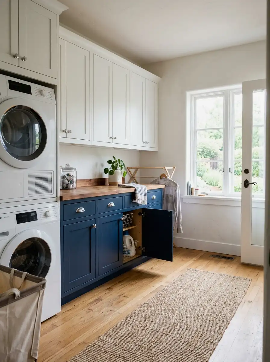
Two-tone doesn’t mean two competing colors fighting for attention. It means a light color on the upper cabinets and a slightly deeper version of the same tone, or a grounded neutral, on the lower cabinets. This approach is one of the better ways to add visual structure to a laundry room that would otherwise feel flat and one-note.
The most reliable combination is white or off-white uppers with gray, navy, or sage lowers. The uppers feel light and open; the lowers feel grounded. It looks like a kitchen design choice applied to a room that usually gets ignored. The cost doubles since you’re buying two different quarts of paint, putting you around $100 to $130 for paint alone, but the visual payoff is significant for a room you walk into every day.
Open shelving is another element worth thinking about here, and there are storage solutions that work alongside painted cabinets if you want a mix of closed and open storage.
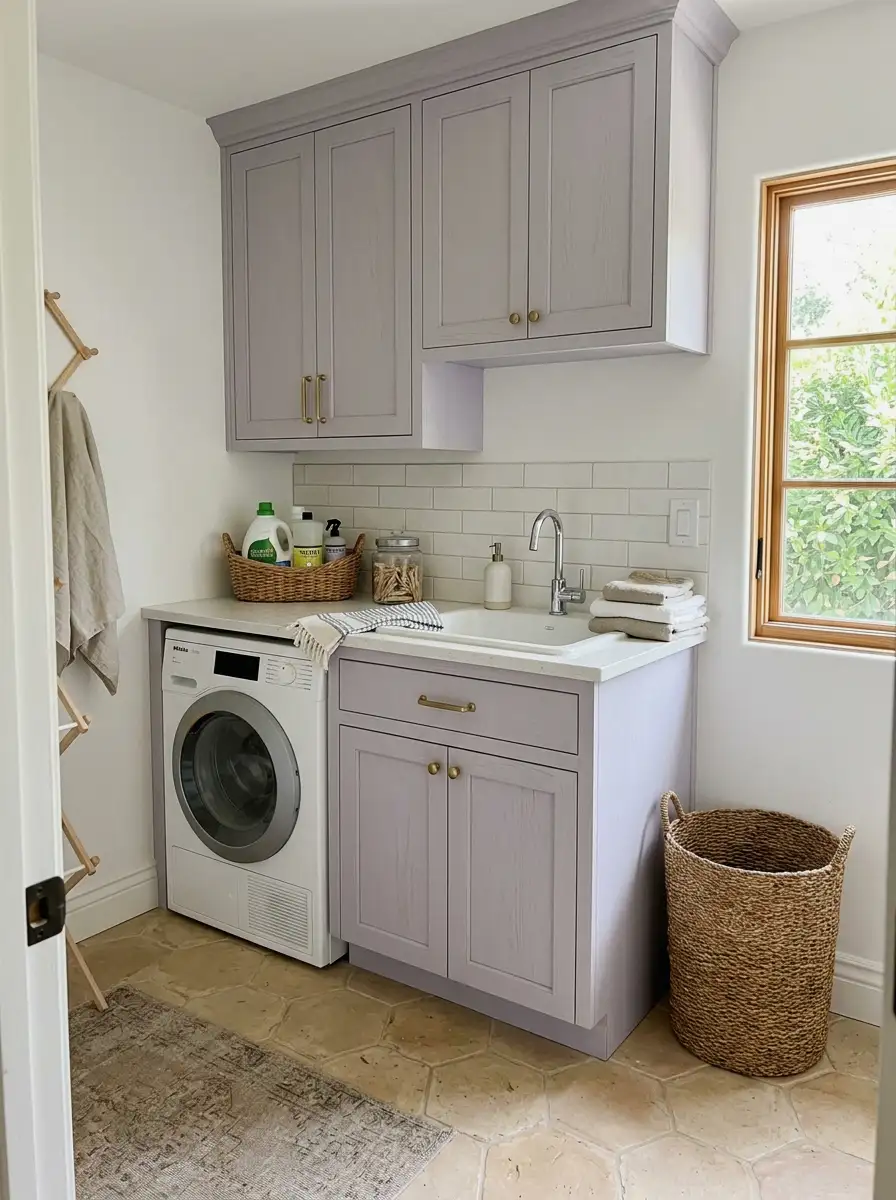
14. Pale Lavender
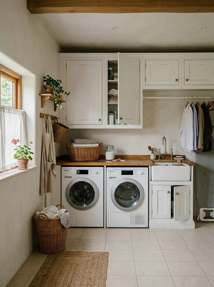
Pale lavender is softer than it sounds. At full saturation, lavender would be overwhelming. At a diluted, almost grayish tone, it does something interesting in a laundry room: it’s calm, it’s fresh, and it doesn’t look like any other laundry room you’ve seen. That last part matters more than people think.
Look for desaturated lavender options like Sherwin-Williams “Inky” at a very light value, or Benjamin Moore “Violet Mist.” These look almost gray in some lights and gently purple in others, which gives the room a quality that’s hard to pin down but easy to like. It pairs especially well with brushed brass hardware, which is an easy and affordable way to add a finishing touch without spending more than $30 to $50 on new pulls.
More Ideas:
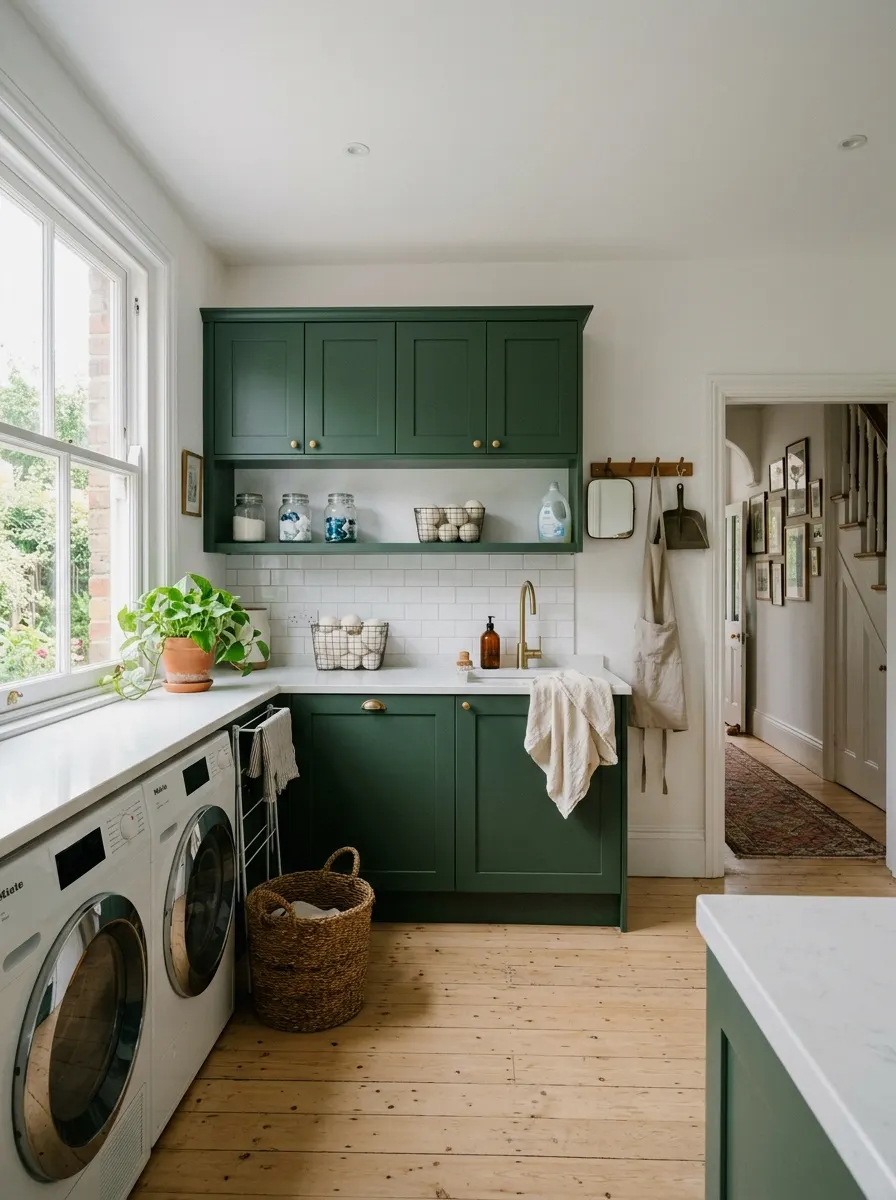
15. Forest Green

Forest green on cabinets is a commitment, but it’s one that pays off in a laundry room. It’s grounding, it’s rich, and it makes the room feel less like a side thought and more like a real part of the house. The depth of a dark green reads as intentional in a way that medium tones sometimes don’t.
So here’s the practical side: this works best with lighter walls and good lighting. If your laundry room has a window or strong overhead light, forest green cabinets can look really nice. If it’s a completely interior room with one ceiling fixture, test a large swatch first before committing. Farrow and Ball “Calke Green” or Sherwin-Williams “Hunt Club” are classic options in this range. Expect to pay $60 to $80 per quart for quality paint in a deep tone.
16. Warm White with Visible Wood Grain

This one is a bit different. Instead of a solid painted finish, you go for a warm white wash or white stain that lets the natural wood grain show through. It gives the cabinets a texture and warmth that flat paint never achieves, and it’s a very 2025 and 2026 look that holds up well over time without looking trendy.
The application requires more prep than standard painting. You need to sand the existing finish off to get to bare wood, apply a thinned white stain or pickling wash, then seal with a water-based clear coat. The materials run about $80 to $120 total, and the process takes a full day. But the result is something genuinely different from every other option on this list, and it ages beautifully because the natural variation in the grain becomes part of the look.
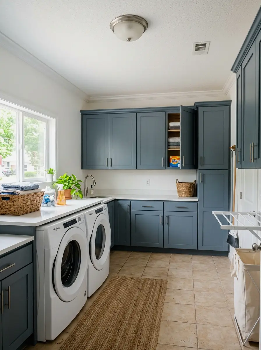
17. Slate Blue-Gray

Slate is one of those colors that feels both neutral and not neutral at the same time. It has enough blue in it to feel intentional but enough gray to work as a background. In a laundry room, it reads as calm and a little sophisticated, without trying to be a statement color. It’s one of the better options for people who want something other than white but don’t want to take a real risk.
Benjamin Moore “Van Deusen Blue” at a lighter value, or Sherwin-Williams “Uncertain Gray” with blue undertones, are both solid slate options. The finish matters here too: a satin finish on slate-colored cabinets looks much more polished than a flat finish. And the satin is easier to wipe clean, which in a laundry room is a genuinely practical upgrade. Budget around $50 to $70 for a quart with good coverage.
18. Bold Color with White Interiors
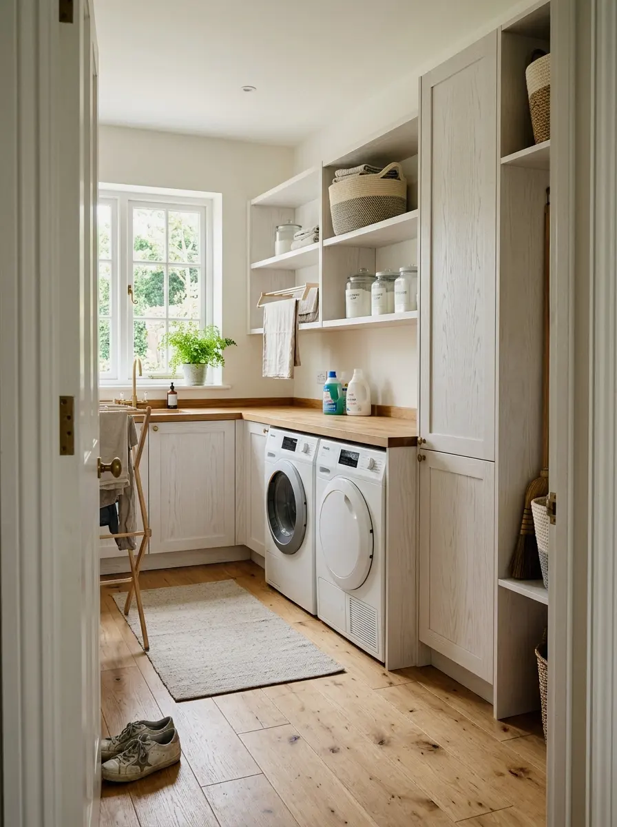
The last idea is a technique more than a specific color. Paint the exterior of your cabinets in whatever bold shade you love, and paint the interiors bright white. When the doors are open, that white interior makes the inside of the cabinet feel larger and brighter. When the doors are closed, you get the full impact of the color.
This works with any of the deeper tones on this list: navy, forest green, charcoal, terracotta. The white interior is a small detail that most people skip, and it’s the detail that makes bold-colored cabinets look finished rather than just painted. It adds maybe 30 to 45 minutes to the total project time and costs almost nothing since you likely already have white paint. Try it once. You’ll see the difference immediately.
More Ideas:
Final Thoughts on Laundry Room Cabinet Colors
You’ve got 18 real options here, and they cover the full range from safe and simple to bold and committed. The biggest theme running through all of them is this: the right color is the one that fits what your room already has going for it, whether that’s good light, white walls, or good bones.
Start small if you’re unsure. Pick one or two colors from this list that genuinely excite you and buy sample pots before you commit to a full quart. Paint a large patch, live with it for a day or two, and see how it looks under your actual lighting in the morning and at night.
Once the color is locked in, there are also some organizational upgrades that finish the room off and make the whole project feel complete.
If you want more ideas like this for real homes and real budgets, homelypop.com has a lot more where this came from.